Table of Contents
Are you trying to find the best virtual staging service? This post covers an in-depth Virtually Staging Properties review, where I’ve looked into their ordering process, furniture library, virtual staging quality, and support.
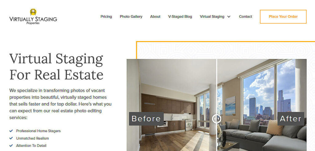
Virtual Staging Properties is a specialist virtual staging company based out of Atlanta, Georgia. They have a simple and clean website, a great-looking gallery, and the interface seems user-friendly.
With that said, I’m excited to take a closer look at their service and what they’re offering.
But first, here’s a comparison table of Virtually Staging Properties and PhotoUp’s virtual staging services:
| Overall Rating |

|

|
| 2.6 | 4.8 | |
| Provider | Virtually Staging Properties | PhotoUp |
| Current Ranking | 12th of 25 | 1st of 25 |
| Best For | library size | best overall |
| Cost per Image | $39.00 per image | $20.00 per image |
| Turnaround Time | 48-72 hours | 12-48 hours |
Furniture

|
||
| Online Library | yes | yes |
| Design Styles | 12 or more design styles | 12 or more design styles |
| Room Types | 12 or more room types | 12 or more room types |
Pricing

|
||
| Cost per Image | $39.00 per image | $20.00 per image |
| Cost of Revision | no | free revisions |
| Volume Discount | no | yes |
Ordering

|
||
| Turnaround Time | 48-72 hours | 12-48 hours |
| Weekend Service | no | yes |
| Interface | hard to learn/navigate | good & easy to learn |
Quality

|
||
| Realism | quite good | very realistic |
| Placement | okay | natural |
| Set Design | okay | amazing |
Support

|
||
| yes | yes | |
| Chat | no | yes |
| USA Phone | yes | yes |
| Response Time | 6 hours | 5 minutes |
| Website | virtuallystagingproperties.com | photoup.net |
| Other Services |
|
|
Fast & Affordable
Virtual Staging Service
Interiors. Landscapes. Commercial. Virtually transform any space.
Virtually Staging Properties Overview
Virtually Staging Properties (VSP) is a company run by its founders, Jay and Kristzina Bell, who are real estate professionals from Atlanta, Georgia.
Their experience with home staging and real estate led to the founding of the company. Their goal is to provide the widest range of home decor options available to suit any taste.
Although they are quite new to the online world, their service seems slick and well organized.
However, one thing I noticed on the site is that the blog hasn’t been updated for over a year, which is a bit concerning.
Ordering From Virtually Staging Properties
To begin, the order process begins nicely with a big “Place Your Order” button on the Home Page to get you started.

1. Choose Virtual Staging Plan
In the next step, you’re asked if you want to select the Custom Option for $60 or the Express Option for $39 (I chose Express for this review).

2. Order Form
When you click the big yellow button, you are taken to the order form.
This contains a long, slightly confusing page that includes all the financial interactions, as well as the ordering and selecting of your virtual images.

To my frustration, I ran into my first problems at the ordering stage, as VSP didn’t accept either Paypal or Debit Cards.
You could only use a credit card, which I don’t have, so that slowed me down somewhat.
Nevertheless, I was able to borrow one and select a plan, but it was a bit deflating.
3. Upload Photos
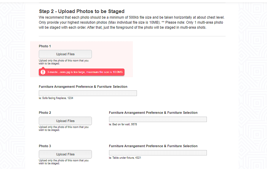
Once the payment issue was sorted out, I began to upload images but ran into a second problem.
I got an error message saying: “Your images cannot be bigger than 10MB.” So, I needed to use Photoshop to down-size my images, which was another pain point I hadn’t expected.

Also, the ordering and payment screen is all part of the ordering process, so you work your way down slowly from top to bottom.
And then, you complete the order process by accepting the terms & conditions at the bottom of the form.

Overall, the order process isn’t exciting or sophisticated, but it seems perfectly functional at this stage.
And hopefully, the results will speak for themselves.
Furniture Library
The furniture library is one of VSP’s best features.
As a matter of fact, they have interesting designs and pieces of furniture to choose from.
And there’s a wide range of options, despite the fact that there are only three styles on offer (Transitional, Traditional, Contemporary, and Child for a kid’s bedroom).
Select Furnishings for Staging
Once you have paid for your images, you move on to Step 1, which is to select furnishings for your stagings.

And for each new room type, a new tab opens with a pdf of the library.
Although the furniture is nice, it’s a slightly clumsy interface and definitely open to errors when you select your numbers and transfer them back to the order form.
(More than once, I had to go back and double-check what I chose and then found it hard to get back to the set where I wanted.)
In like manner, I also struggled to find the option of kitchen/dining room hybrid amongst the room types but chose a dining room layout in the hopes that it’s appropriate.
As you can see on the screenshot below, the JPEGs of the furniture sets in the library are quite small and it’s difficult to see the details.

When you click on the room style you want, it opens up a pdf of the catalog for you to browse.
Besides, there’s no interactivity in the library. You are required to remember the number of the set you like, and then write down the number in a text box where you have uploaded the image, alongside any other instructions you may have.
Nonetheless, I was able to make my selections from the furniture sets and look forward to the results.
Delivery of Images
After a few back-and-forth exchanges with the VSP team and a couple of spam emails later, the images were delivered.
It took approximately 55 hours, which is a long turnaround time.
In addition, the notification that your images are available arrives via email.

When clicking on the email, it opens an interface called “Hightail”, where you can download your images.
The layout is slick and easy to understand. Although, I was surprised to see that the images are only available for a week.

Virtual Staging Quality
Now, let’s take a closer look at the images which have come back from VSP:
MASTER BEDROOM:
The potplant I asked for worked well, but the rest left me feeling a little empty.
No doubt I chose those lamps, but I couldn’t imagine sleeping with that lamp hanging over the bed as if you were being interrogated!
Also, the colors are a little dull. So all in all, this was my least favorite of the three rooms.
KITCHEN / DINING AREA:
In my opinion, the color scheme of the furniture and the wood works well with the room.
The ironwork on the table and the stools are strong. I also appreciate the artwork on the wall in the passage.
A major mistake was that they didn’t add a fridge in the kitchen section.
How could they miss that?!
Be that as it may, my guess is that it was because the catalog selection did not include a kitchen option.
LIVING ROOM:
There are some really nice elements in the way that the room is laid out. The rug is great, the artwork and the lamp too.
But I wonder why that single chair was placed where it was?
I do acknowledge that this is a tough room to furnish.
Additionally, the two tables come across as slightly digital in the rendering, and I’m always pleased when drapes are added to the big main window.
All in all, I found the images were good but not great. The quality of the renders was good across the board, but the bedroom was a little dull and lacking in flair.
Support
When I sent an email inquiry about weekend orders and bulk discounts, the founder of the company answered personally after a four-hour wait.
It was great to hear directly from Jay Bell. On the other hand, that level of direct contact does give the impression that the service is rather small and would buckle under a lot of traffic. But perhaps it’s a group of employees all speaking in his name.
Furthermore, one problem that came up was that an initial query from my allotted designer ended up in my spam folder for some reason.
This added an extra 24 hours to the delivery of my images.
With this in mind, that’s one of the drawbacks of relying so heavily on email for communication with the client.
Pros and Cons of Virtually Staging Properties
To give you a better overview, here are some pros and cons of Virtually Staging Properties:
| PROS | CONS |
| User-friendly website | High pricing |
| Decent quality of product | Long delivery time |
| Extensive furniture library | Furniture catalog in pdf format |
| No PayPal support | |
| Image size limit |
Verdict: Is Virtually Staging Properties Worth It?
My final verdict of this Virtually Staging Properties review is that they provide a simple and functional site that does what it says it does.
In contrast to the site’s usability, I found the lack of debit cards or Paypal supports a bit problematic.
Also, the fact that I had to go and adjust all my images to under 10MB was annoying. But once that was done it proceeded smoothly.
Overall, the website is simple and effective, but there’s a heavy reliance on email for the process to work.
My expectations for Virtually Staging Properties were high thanks to their high price point, and I feel like they do meet them without surpassing expectations.
So, with a little bit of work on the payment options, increased innovation, and less reliance on email, Virtual Staging Properties could become a prominent player in the virtual staging industry.
I hope you enjoyed reading my in-depth Virtual Staging Properties review. If you did, I recommend that you check out the following resources as well:


